

What better examples are there of the purposeful use of perceptual grouping tendencies than in camouflage, whether natural or manmade? Just as in color blindness charts, components are determined by varying degrees of similarity, proximity and continuity.
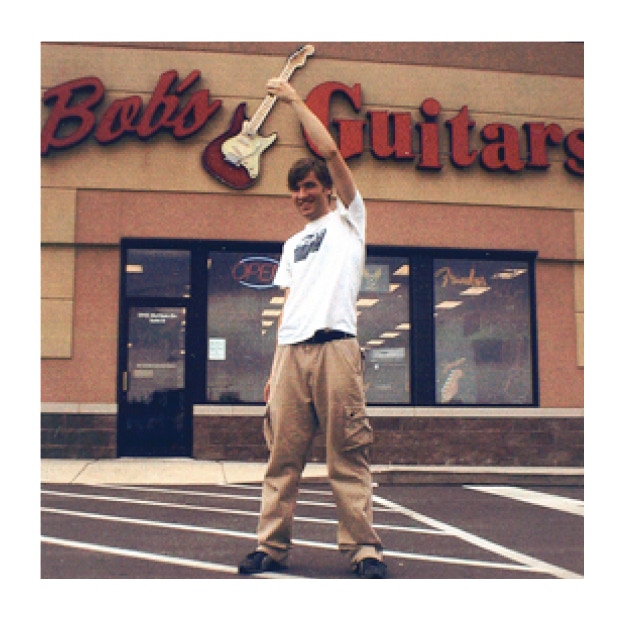
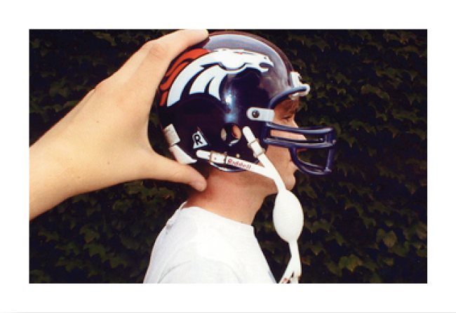
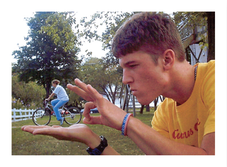
Above Just three of many experiments by graphic design students at the University of Northern Iowa, in which they have set up perceptual grouping errors or “visual bloopers” to demonstrate the effectiveness of Gestalt organizing principles.
“Shape may, from this point of view, be regarded as a kind of stylistic ‘mean’ lying between the extremes of chaotic overdifferentiation and primordial homogeneity. Thus, while a balanced relationship, as established within the style, produces an impression of well-organized patterns, exaggerated differentiation gives rise to disorganized ones, and intensified uniformity results in unorganized ones.”
Emotion and Meaning in Music
Beauty, one hears ad nauseum, is in “the eye of the beholder.” Esthetic standards are subjective; there is no reliable critical gauge, and formal issues have drifted in the vapor of what is derided as “taste.” (Among artists, it is now customary to use the word “esthetic” as a synonym for any subjective “point of view,” so that any person’s likes and dislikes constitute his or her “esthetic.”) As a result, discussions of art and esthetics are seen as innocuous, “academic” digressions, in part because things that are beautiful, while pleasurable to witness, are most likely of little significance in the prosaic, pragmatic utility of the “real world.” Even among artists, esthetics is discredited because many (perhaps most) no longer assume that an artist’s responsibility is to make beautiful objects. As the Czech-born American painter Barnett Newman once said, “Esthetics is for me as ornithology must be for the birds” (quoted in Crofton 1989, 46).
The word “anesthetic,” on the other hand, has evolved in a subtle, less radical way. It still means the partial or total loss of sensation, the opposite of perceptibility. But it almost always refers to chemically-induced anesthesia, administered before or during surgery. Only rarely does it mean a non-chemical loss of sensation, as when, for example, a person experiences meditative trance, brought on by sustained exposure to extreme similarity (or humdrum), such as monotonous chanting, resulting in hypoarousal; or ecstatic trance, brought on by sustained exposure to extreme diversity (or hodgepodge), such as spasmodic song and dance, resulting in hyperarousal. The Ancient Greeks, like presumably most cultures throughout history (including our own), were aware of and made willful use of trance-induced anesthesia, as in the Hippocratic use of dance as a cure for bacchanalian madness.
Meditative and ecstatic trances are anesthetic mental states. When we engage in them (whether Balinese dancers, Masai warriors, Indian Yogis, Buddhist priests, Haitian voodoo worshippers, Pentecostal Christians, or more subdued practitioners of secular stress-avoidance techniques like Transcendental Meditation) we undergo a relative lack of connection with sensory stimuli, a partial anesthesia, a state of oblivion (more or less) in which we may not fully sense the kind, location, and timing of the ephemeral, sensuous phantoms that constitute ones life on earth.
There are countless eyewitness examples of this. Among the most vivid is the prison diary of Arthur Koestler, the Hungarian-born novelist, who was captured by the fascists while working as a journalist in Spain in 1937. Accused of spying, Koestler was placed in solitary confinement, awaiting execution. From his cell, he could hear other prisoners in neighboring cells as they were taken out and shot. Not surprisingly, he developed fits of fear, related to what we now commonly call anxiety attacks.
In Dialogue with Death, Koestler documents what he describes as the “anesthetizing” strategies by which he was able to manage his anxiety: In one, he chose a certain line from literature and “repeated the same verse thirty or forty times, for almost an hour, until a mild state of trance came on and the attack passed” (Koestler 1966, 116). This, as he was well aware, was the proven tactic of the Catholic rosary, “of the prayer mill, of the African tom-tom, of the age-old magic of sounds” (Koestler, ibid). It was meditative trance, brought about by “primordial homogeneity” [Leonard Meyer’s term], repetitive uniformity.
In a second method, he selected an intricate concept (“such as Freud’s theories about death and the nostalgia for death”) and then free associated until, “after a few minutes, a state of feverish exaltation was evoked, a kind of running amok in the realm of reasoning, which usually ended in a day dream” (Koestler, ibid). It was an ecstatic trance, induced by unbridled meandering thought.
Thinking about esthetics in relation to anesthetics, it may be of value to picture them on a linear continuum, like that of a color spectrum. At opposing poles are the two varieties of anesthesia, high similarity (humdrum, monotony, meditative trance, and hypoarousal) and high difference (hodgepodge, mayhem, ecstatic trance, and hyperarousal), while the fluctuating central zone is esthetic experience.• This concurs with the age-old, familiar belief that esthetic arrangements (in visual art, music, literature, dance, theatre, and so on) have in common the elusive form attribute of unity-in-variety (also sometimes cited as “repetition with variation,” “strict wildness,” or “harmonious disarray”), which is explained to some degree by the perceptual organizing principles (e.g., similarity, proximity, and continuity) that Gestalt psychologist Max Wertheimer described in 1923 (Wertheimer 1939), and which Fritz Heider later called unit forming factors (Heider 1983).


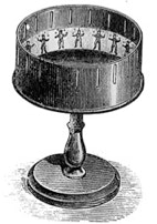
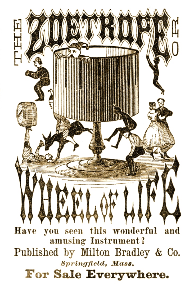
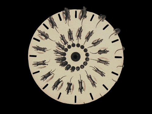
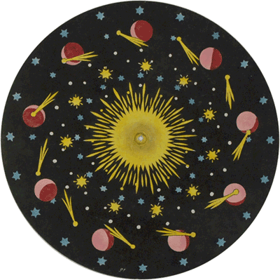
Legend has it that Max Wertheimer began to investigate the perceptual organizing principles in 1910, while he was traveling by train on vacation. He became interested in the apparent movement he observed in the flashing lights at a railroad crossing (top right). A comparable effect is seen in the sequence of lights on a theatre marquee (bottom). Through his experiments, Wertheimer confirmed that different Gestalts (or “whole effects”) result from different configurations of the same components, or by minute adjustments in timing. In the top left, for example, the speed of the flashing lights is set at one-tenth of a second, in which case they appear to be two stationary lights, simply blinking on and off. In the top right, using the same components but slowing the speed to one-half second, the same lights appear to be one light moving back and forth. When Wertheimer got off the train at Frankfort, he bought a motion picture toy, a zoetrope (above left sidebar), with which to experiment. The zoetrope was one of many children’s toys that anticipated motion pictures.
an essay by
initially published in
Gestalt Theory: Journal of the GTA
Vol 24 No 4 (2002), pp. 317-325.
Copyright © by the author.
On Esthetics
and Gestalt Theory
How Form Functions
In an entry in his journal, Gestalt psychologist Rudolf Arnheim remembers a certain convention one year of the American Society of Aesthetics: “Much confusion arose,” he recalls, “when the Society for Anesthetics met at the same time in the same hotel” (Arnheim 1989).
The terms esthetic and anesthetic (or, as also commonly spelled, “aesthetic” and “anaesthetic”) are historically closely related. In the original Greek, they were counterparts of the same root concept, aisthetikos, which referred not just to works of art but to all sensory input. Any experience could be regarded as esthetic if provocative, striking, and stirringly felt, whereas anesthetic experiences were benumbing or stupefying. Esthetic quality was not a question of prettiness nor pleasantness, but of vividness and cogency.
Since the 18th century, the meanings of these terms have changed. Today, despite their common origins, “esthetic” is rarely if ever defined as the antonym of “anesthetic.” Perhaps most contemporary philosophers, along with virtually everyone else (as witnessed by dictionary definitions), regard esthetics as the study of beauty, and, especially, the study of beauty in art. So, understandably, it seems like a madcap, surrealist event for estheticians and anestheticians to convene at the same hotel at the same time.
Click on image to enlarge
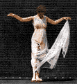
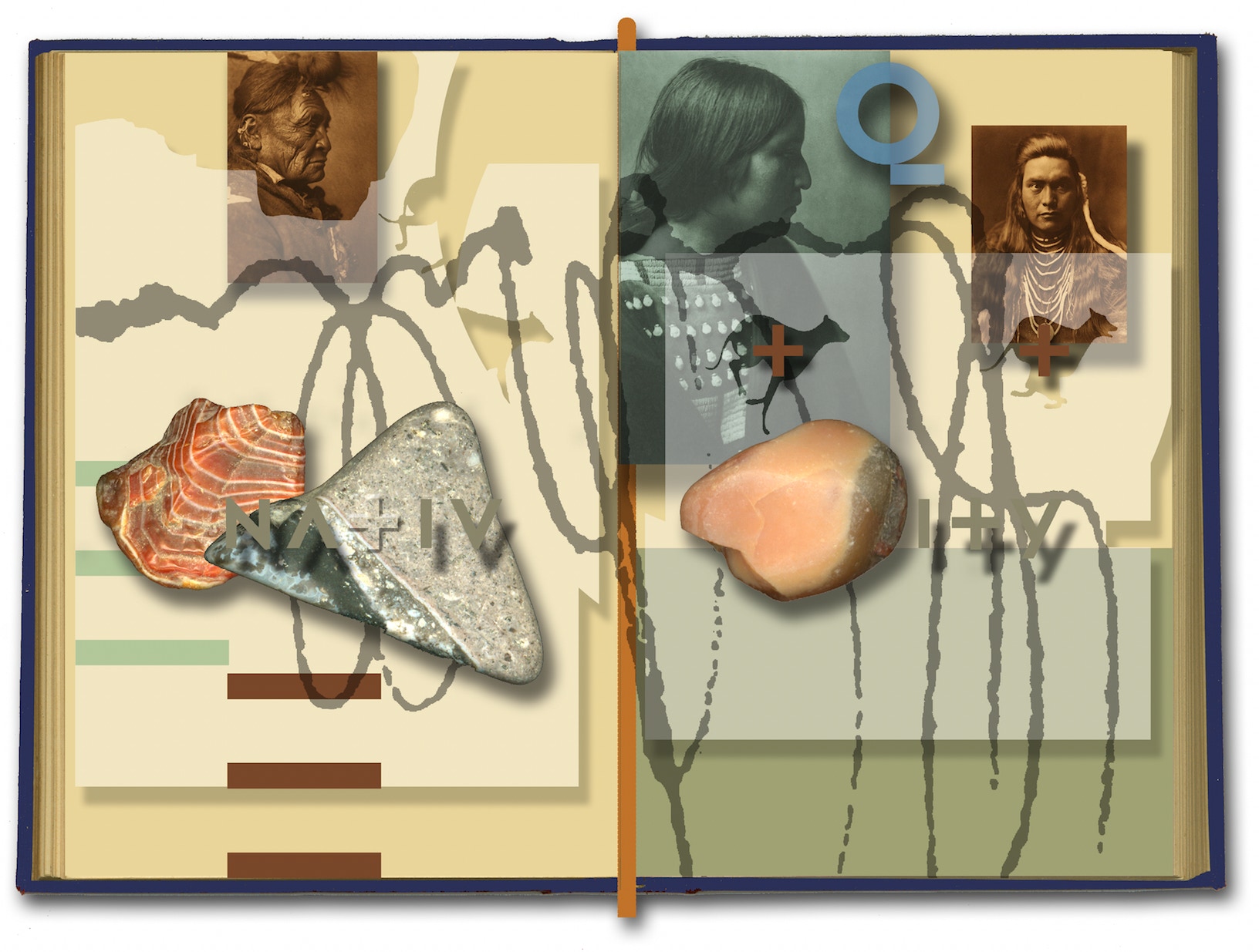
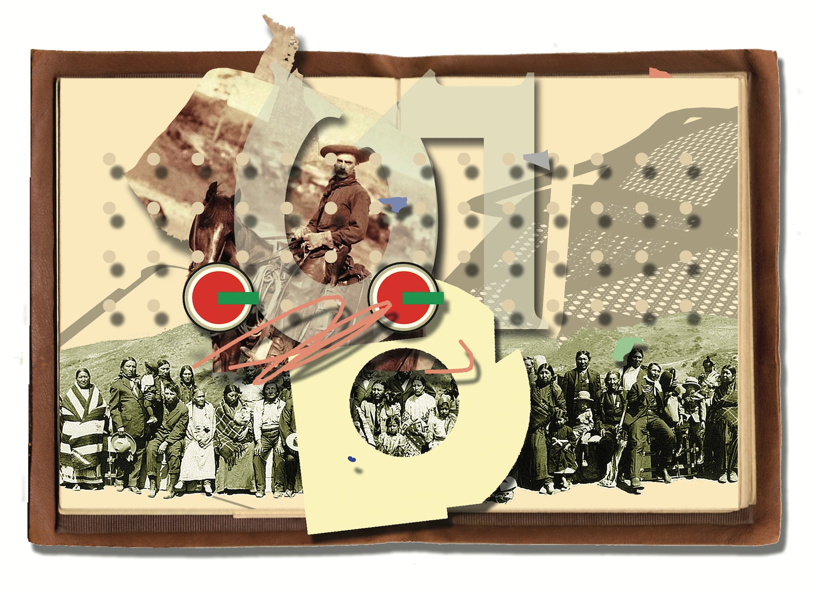
Indigenous Nativity (2006 / 2018), digital montage. Copyright © Roy R. Behrens.

Through continuity, as in this example of edge alignment, components are more likely to connect with one another (to belong together) if they are aligned in space. This is also a famous example of closure.
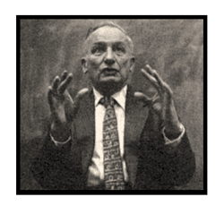
Above Digital animation of Rudolf Arnheim lecturing at the University of Michigan, Ann Arbor, and the cover of his famous book on Art and Visual Perception. In 1971, as a graduate student at the Rhode Island School of Design, I wrote to him at Harvard, explaining that I was beginning to write a book on art and camouflage. Twenty years later, when he was living in retirement in Michigan and I was teaching in Iowa, we began a friendship through wonderful (and inevitably humorous) letters that continued until he was no longer able—RB.

In proximity grouping, components are more likely to appear to belong together if they are nearer to one another. The dots on the left appear to be vertical columns. Those on the right are seen as horizontal rows. Nosmo King (No Smoking) was the stage name of a British comedian.

Umberto Eco—
“I would define the poetic effect as the capacity that a text displays for continuing to generate different readings, without ever being completely consumed.”
NOSMO
KING
In my experience, some of the most persuasive examples of esthetic compositions, informed by Gestalt theory, are the photographs of Joseph Podlesnik (online and in book form), and the collage-like constructions of the late Daniel Weiss—RB.
A poster made in homage to Gestalt theory by Iosa (DeviantArt)
It is also consistent with the writings of American philosopher and educator John Dewey, who contended, in Art and Experience, that “the non-esthetic [or anesthetic] lies within two limits. At one pole is the loose succession [or mayhem] that does not begin at any particular place and that ends—in the sense of ceasing—at no particular place. At the other pole is arrest, constriction [or monotony], proceeding from parts having only a mechanical connection with one another” (Dewey 1958).
British philosopher Alfred North Whitehead once wrote that the defining trait of an esthetic pattern (whether utilitarian or nonutilitarian, visual or nonvisual, artistic or nonartistic) is “the fusion of sameness and novelty; so that the whole never loses the essential unity of the pattern, while the parts exhibit the contrast arising from the novelty of their detail.” More recently, art historian E.H. Gombrich said that “the most basic fact” of esthetic experience is “that delight lies somewhere between boredom and confusion” (Gombrich 1979, 9); while Gestaltist Rudolf Arnheim wrote that “Complexity without order produces confusion,” and that “order without complexity produces boredom” (Arnheim 1964, 1).
Among visual artists, concern for esthetic arrangements is called “design” or “form” or “layout.” Evidence of this is especially found in the work of those visual artists who call themselves “designers,” including graphic designers, typographers, publication designers, illustrators, industrial designers, interior designers, architects, and so on.
To come up with esthetic arrangements, such as the examples reproduced here, a designer has to rely on Wertheimer’s grouping principles, if largely intuitively. As Arnheim has written, “The relative degree of similarity in a given perceptual pattern makes for a corresponding degree of connection or fusion” (Arnheim 1961, 201).
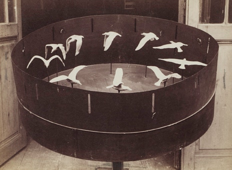
In 1886, the French physiologist Etienne Jules Marey devised what may be the first 3-D movie, by mounting a sequence of flying bird sculptures inside a zoetrope. Making use of current 3-D printing technology, others (among them Pixar Studios) have since produced similar effects, as shown here.

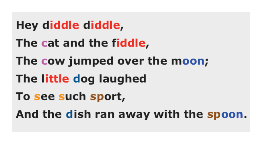
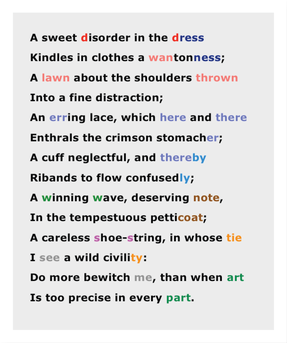
“As music is the poetry of sound,” said James A.M. Whistler, “so is painting the poetry of sight…” But long before him, other writers have noticed that sound patterns in language are used by poets in ways that are comparable to the patterns made in visual art. Here are two color-coded poems, showing their use of alliteration, end rhyme and so on. One is by Mother Goose, and the other is “Delight in Disorder” by Robert Herrick (1648).
Violette de Mazia quoted in Robert Bruce Williams, ed., John Dewey, Recollections (Washington DC: University Press of America, 1970), p. 9.
“[American philosopher John] Dewey’s observations on art were sometimes characterized by a remarkable spontaneous insight. On one of his frequent visits to The Barnes Foundation during which Dr. [Albert C.] Barnes and I were looking at the collection with him, he stopped in front of a [painting by Paul] Cézanne, The Bibemus Quarry, and said with the air of tossing off an incidental remark, ‘If you were to explode a bomb in the middle of this landscape you would have a [painting by Chaim] Soutine.’”

Robert Gibbings
In recent decades, with the dominance of Postmodernism, the ground rules of art have dramatically changed. While the historic contribution of the Gestalt psychologists is still acknowledged by designers, there are artists who find it constricting. Gestaltung is the German word for design, and the subtitle for the Bauhaus in Dessau (the most influential art school of the twentieth century) was Hochschule für Gestaltung (College of Design). That artists have long been aware of the link between design and Max Wertheimer’s grouping principles is confirmed by the author’s acknowledgments in György Kepes’ Language of Vision. First published in 1944 and used widely as a textbook in American courses in art and design, it opens with Kepes’ admission of his indebtedness to the Gestalt psychologists (Wertheimer, Wolfgang Köhler, and Kurt Koffka), whose ideas and visual examples, he notes, are used “in the first part of the book to explain the laws of visual organization” (Kepes 1944, 4).
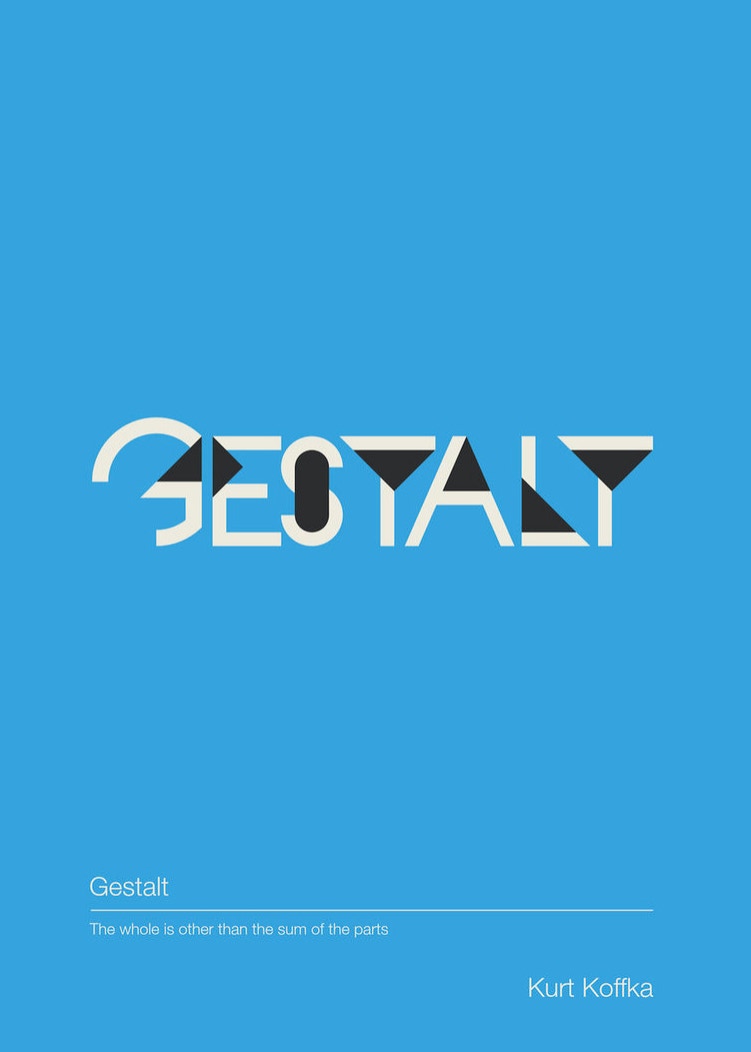
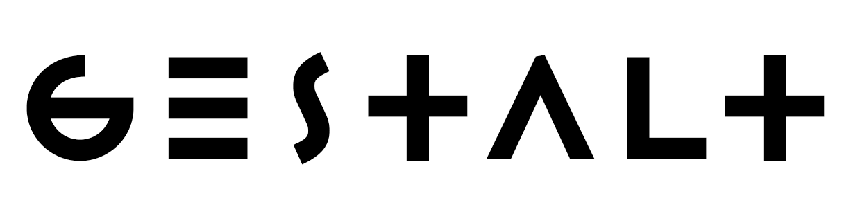
A more recent explicit reminder of this is a typeface named Gestalt, designed by Jonathan Hoefler, an American type designer, in the early 1990s (above, right). This font, which is described in its promotion as “a typographic interpretation of a principle from Gestalt psychology,” pays homage to the notion that “the whole is greater than the sum of its parts,” or, in Hoefler’s words, “that no idea is comprehensible out of context” (Hoefler c2000, 44). It does this by making the type characters (letters, numbers, marks, et al.) so abstract, so ambiguous, that few are recognizable out of context. Some of the letters can only be clearly identified when combined with other type characters to make higher-level words, phrases, and sentences.
This typeface is also a tribute to similarity and proximity grouping, to continuity through edge alignment (familiar to designers as “grid lines”), and to implicitness or closure. Many of its letterforms are abstract geometric bars, circles, and triangles, and may serve as a tacit reminder of Wertheimer’s early experiments with “apparent movement” (in which he used simple lines, arranged in sequence on a strip of paper, to observe the illusion of movement within a motion picture toy called a “zoetrope”), or the diagrams he used in his 1923 paper, which his students thereafter referred to as his Punktarbeit or “dot paper” because virtually all its examples were abstract patterns made of dots (see Behrens 1998 and 2002).
From the onset of Gestalt psychology, recalls Arnheim, its practitioners “looked to art for the most convincing examples of sensitively organized wholes” (Arnheim 1961, 197). People like Christian von Ehrenfels, Wertheimer, and Köhler had interests in music and visual art, less in literature. It is with the help of their writings, Arnheim continues, that we are now able to realize that a well-designed work of art—an esthetic arrangement—is “a Gestalt of the highest degree” (Arnheim, ibid).
• The phrase “fluctuating central zone” is used purposely to imply that there is no fixed point where esthetic patterns firmly stand, precisely in the center between the two anesthetic extremes. Indeed, the most inventive art tends to drift precariously toward the edges. As music theorist Leonard Meyer has noted, “…some of the greatest music is great precisely because the composer has not feared to let his music tremble on the brink of chaos, thus inspiring the listener’s awe, apprehension, and anxiety and, at the same time, exciting his emotions and his intellect” (Meyer 1956, 161). In contrast, the work of other composers, such as Philip Glass, may favor the high similarity end.
•• Soon after completing this essay [in 2002] I was saddened to learn of the passing of two important writers, both of whom are quoted here, and who greatly influenced my notions of art, esthetics, and Gestalt theory. They were art historian E.H. Gombrich (1909-2001), who died on November 5, and painter and designer György Kepes (1906-2001), who died on December 29.
REFERENCES
ARNHEIM, R. (1961). “Gestalt Psychology and Artistic Form” in L.L. Whyte, ed., Aspects of Form. Bloomington: Indiana University Press.
ARNHEIM, R. (1964). Entropy and Art. Berkeley, California: University of California Press.
ARNHEIM, R. (1989). Parables of Sun Light. Berkeley, California: University of California Press.
BEHRENS, R. (1998). “Art, Design and Gestalt Theory” in Leonardo 31(4), pp. 299-303. Available online.
BEHRENS, R. (2002). False Colors: Art, Design and Modern Camouflage. Dysart, Iowa: Bobolink Books.
BEHRENS, R. (2009). Camoupedia: A Compendium of Research on Art, Architecture and Camouflage. Dysart, Iowa: Bobolink Books.
BEHRENS, R. (2011). Ship Shape: A Dazzle Camouflage Sourcebook. Dysart, Iowa: Bobolink Books.
CROFTON, I. (1989). A Dictionary of Art Quotations. New York: Schirmer Books.
CSIKSZENTMIHALYI, M. (1990). Flow: The Psychology of Optimal Experience. New York: Harper and Row.
DEWEY, J. (1958). Art as Experience. New York: Capricorn Books.
GOMBRICH, E.H. (1979). The Sense of Order. Ithaca, New York: Cornell University Press.
HEIDER, F. (1983). The Life of a Psychologist: An Autobiography. Lawrence: University Press of Kansas.
HOEFLER, J. (c2000). Catalogue of Typefaces. No. 4. New York: Hoefler Type Foundry.
KEPES, G. (1944). Language of Vision. Chicago: Paul Theobald.
KOESTLER, A. (1966). Dialogue With Death. T. and P. Blewitt, trans. New York: Danube Edition, MacMillan.
MEYER, L. (1956). Emotion and Meaning in Music. Chicago: University of Chicago Press.
SIKES, G. (1986). “Poster Painting” in How 1(6), pp. 30-37.
WERTHEIMER, M. (1939). “Laws of Organization in Perceptual Forms” in W.D. Ellis, ed., A Source Book of Gestalt Psychology. New York: Harcourt Brace.
ZERUBAVEL, E. (1991). The Fine Line: Making Distinctions in Everyday Life. Chicago: University of Chicago Press.
ZERUBAVEL, E. (2015). Hidden in Plain Sight: The Social Structure of Irrelevance. New York: Oxford University Press.
Deplorable Strikes (2006), digital montage. Copyright © Roy R. Behrens.


Colm Toibin in Robin Robertson, ed., Mortification: Writers' Stories of Their Public Shame (New York: HarperCollins, 2004)
“[In the early 1990s, Colm Toibin, an Irish writer who had published a prize-winning novel, The South, was interviewed on a television show. A prior guest that day on the same program was American writer Norman Mailer, who, in the process of departing, paused in the studio and looked closely at the cover of Toibin's book:]
'The Outh,' he [Mailer] said approvingly, touching the jacket of the book.
'No,' [Toibin recalled] I said almost breathlessly, 'The South.'
He seemed puzzled. We both looked down at the jacket.
The graphic designer had made a beautiful S in a different color and typeface to the 'O-u-t-h' so that the last four letters were perfectly clear against a blue background, but the S was not so clear. I traced my finger along the S to show him it was there. He smiled sadly.
'So it's not The Outh?' His tone was amused, relaxed, mellow. He seemed to have liked saying the word Outh, he had made it long and glamorous-sounding and the afterglow of saying it stayed with him now in a slow smile.
He began to turn. His wife was waiting for him.
'I thought it was an Irish word,' he said."
“…at moments of intense esthetic experience we see not only with our eyes but with the whole body. The eyes scan, the cortex thinks, there are muscular stresses, innervations of the organic of touch, sensations of weight and temperature, visceral reactions, feelings of rhythm and motion—all sucked into one integrated vortex.”
Arthur Koestler, The Act of Creation. New York: Macmillan, 1964, p.371.